Seaborn 图例函数
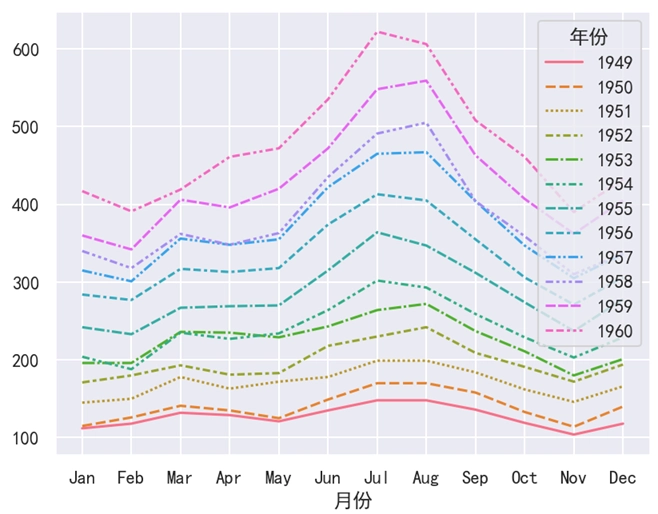
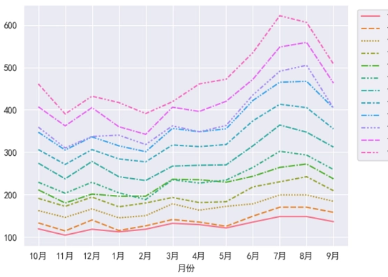
在实际开发中,图例都是在图表的内部进行绘制的。但是有些图例过多时,会覆盖原来的图表,如下图所示。
在 Seaborn 中,我们可以使用 legend() 这个函数来调整图例的位置。
语法:
plt.legend(loc, bbox_to_anchor)说明:
需要注意的是,legend() 是 Matplotlib 中的函数,而不是 Seaborn 中的函数。
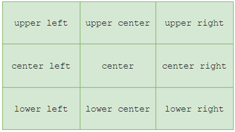
loc 是一个可选参数,用于指定图例的位置。loc 的取值是一个字符串,取值情况共有 9 种,如下表和下图所示。左边部分代表纵轴位置,右边部分代表横轴部分。
| 取值 | 说明 |
|---|---|
| upper left | 左上 |
| upper center | 靠上居中 |
| upper right | 右上 |
| center left | 居中靠左 |
| center | 正中 |
| center right | 居中靠右 |
| lower left | 左下 |
| lower center | 靠下居中 |
| lower right | 右下 |
bbox_to_anchor 是一个可选参数,用于定义指定图例在轴的位置。最后特别注意一点, legend() 函数必须放在绘图函数后面使用,否则就会有问题。
Seaborn 图例示例
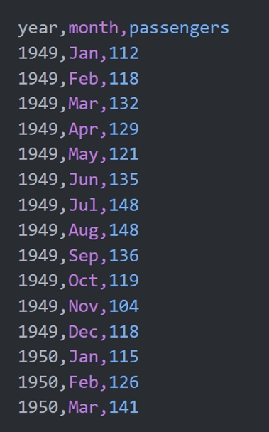
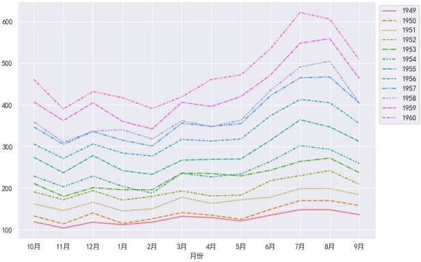
Seaborn 内置了一个数据集 flights,该数据集保存的是某航空公司 1949 ~ 1960 这 12 年内每个月的乘客人数,部分数据如下图所示。其中,我们可以使用 sns.load_dataset('flights') 来加载并使用这个数据集。
示例 1:loc 参数
import pandas as pd
import matplotlib.pyplot as plt
import seaborn as sns

# 设置
sns.set_theme(rc={'font.sans-serif': 'SimHei', 'axes.unicode_minus': False})

# 加载数据
df = sns.load_dataset('flights')
# 重命名列
df.rename(columns={'year': '年份', 'month': '月份', 'passengers': '人数'}, inplace=True)

# 使用透视表,重构DataFrame
df = df.pivot_table(index='年份', columns='月份', values='人数')
# 行列转置
df = df.T
# 绘制图表
sns.lineplot(data=df)

# 调整图例位置
plt.legend(loc='upper right')

# 显示
plt.show()
运行之后,效果如下图所示。
分析:
plt.legend(loc='upper right') 表示将图例定义在图表的 “右上方”。对于一般的图表,我们可以使用 loc 参数来改变它的位置。但是对于这个例子来说,图例依然是覆盖到了图表。此时使用 loc 参数是行不通的,而应该使用 bbox_to_anchor 参数才行。
示例 2:bbox_to_anchor 参数
import pandas as pd
import matplotlib.pyplot as plt
import seaborn as sns
# 设置
sns.set_theme(rc={'font.sans-serif': 'SimHei', 'axes.unicode_minus': False})
# 加载数据
df = sns.load_dataset('flights')
# 重命名列
df.rename(columns={'year': '年份', 'month': '月份', 'passengers': '人数'}, inplace=True)
# 使用透视表,重构DataFrame
df = df.pivot_table(index='年份', columns='月份', values='人数')
# 行列转置
df = df.T
# 绘制图表
sns.lineplot(data=df)
# 调整图例位置
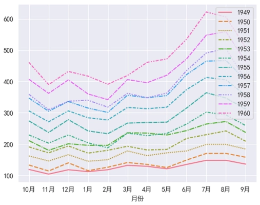
plt.legend(loc='upper left', bbox_to_anchor=(1, 1))
# 显示
plt.show()运行之后,效果如下图所示。
分析:
对于 plt.legend(bbox_to_anchor=(1.2, 1)) 来说,1.2 表示将图例的位置放在横轴的 120% 处,然后纵轴位置是 100%。
但是问题又来了,由于画布较小,此时图例跑到画布的外面去了。所以我们还得使用 Matplotlib 的 figure() 函数来改变画布大小才行。由于画布样式是全局的,对于这种全局样式,必须在绘图函数调用之前设置。
示例 3:改变画布大小
import pandas as pd
import matplotlib.pyplot as plt
import seaborn as sns

# 设置
sns.set_theme(rc={'font.sans-serif': 'SimHei', 'axes.unicode_minus': False})

# 画布大小
plt.figure(figsize=(9, 6))

# 加载数据
df = sns.load_dataset('flights')
# 重命名列
df.rename(columns={'year': '年份', 'month': '月份', 'passengers': '人数'}, inplace=True)

# 使用透视表,重构DataFrame
df = df.pivot_table(index='年份', columns='月份', values='人数', observed=True)
# 行列转置
df = df.T
# 绘制图表
sns.lineplot(data=df)

# 调整图例位置(注意这里是1,不再是1.2)
plt.legend(bbox_to_anchor=(1, 1))

# 显示
plt.show()
运行之后,效果如下图所示。
分析:
由于画布样式针对的是全局,所以 figure() 函数必须在绘图函数之前进行调用,不然就会有问题。