Seaborn 刻度标签函数
有些情况下,坐标轴默认的刻度标签并不能满足我们的开发需求。在 Seaborn 中,我们可以使用 set_xtickslabels() 函数来定义 x 轴的刻度标签,也可以使用 set_ytickslabels() 函数来定义 y 轴的刻度标签。
语法:
ax.set_xticklabels(labels, rotation=n)
ax.set_yticklabels(labels, rotation=n)
说明:
labels 是一个必选参数,用于定义刻度标签。它是一个列表或一个可迭代对象(比如 range 对象)。
rotation 是一个可选参数,用于定义旋转角度。当 n 是正数时,表示逆时针旋转;当 n 是负数时,表示顺时针旋转。
Seaborn 刻度标签示例
接下来,我们通过几个简单的例子来介绍一下 Seaborn 是如何设置刻度标签的。
示例 1:Seaborn 设置刻度标签
import pandas as pd
import matplotlib.pyplot as plt
import seaborn as sns
# 设置
sns.set_theme(rc={'font.sans-serif': 'SimHei', 'axes.unicode_minus': False})
# 数据
data = [
['2025-01-01', 36.0],
['2025-01-02', 36.1],
['2025-01-03', 36.6],
['2025-01-04', 36.2],
['2025-01-05', 36.4],
['2025-01-06', 36.5],
['2025-01-07', 36.0],
['2025-01-08', 36.2],
['2025-01-09', 36.4],
['2025-01-10', 36.8]
]
df = pd.DataFrame(data, columns=['日期', '体温'])
df.set_index('日期', inplace=True)
# 绘图
ax = sns.lineplot(data=df)
# 定义 x 轴刻度标签
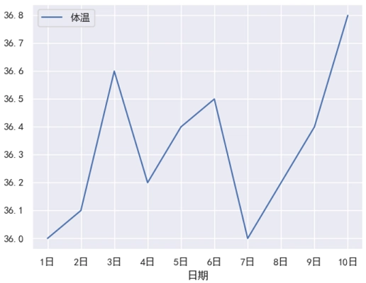
dates = [str(i)+'日' for i in range(1, 11)]
# 告诉图表,要在哪些位置显示刻度(这里是 0 到 9)
ax.set_xticks(range(len(dates)))
# 再把这些位置的标签换成想要的文字
ax.set_xticklabels(dates)
# 显示
plt.show()运行之后,效果如下图所示。
分析:
如果没有使用自定义的 x 轴刻度,那么对于这个例子来说,就会使用 “日期” 这一列的数据作为 x 轴刻度标签,此时得到的效果如下图所示。
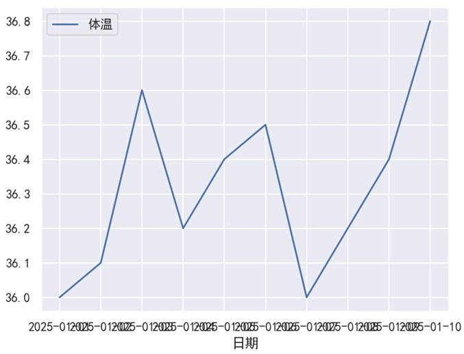
可以看到,此时 x 轴刻度标签挤在一起了,用户体验非常差,也并不是我们预期想要的效果。
示例 2:旋转标签
import pandas as pd
import matplotlib.pyplot as plt
import seaborn as sns
# 设置
sns.set_theme(rc={'font.sans-serif': 'SimHei', 'axes.unicode_minus': False})
# 数据
data = [
['2025-01-01', 36.0],
['2025-01-02', 36.1],
['2025-01-03', 36.6],
['2025-01-04', 36.2],
['2025-01-05', 36.4],
['2025-01-06', 36.5],
['2025-01-07', 36.0],
['2025-01-08', 36.2],
['2025-01-09', 36.4],
['2025-01-10', 36.8]
]
df = pd.DataFrame(data, columns=['日期', '体温'])
df.set_index('日期', inplace=True)
# 绘图
ax = sns.lineplot(data=df)
# 定义x轴刻度
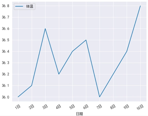
dates = [str(i)+'日' for i in range(1, 11)]
# 告诉图表,要在哪些位置显示刻度(这里是 0 到 9)
ax.set_xticks(range(len(dates)))
# 再把这些位置的标签换成想要的文字
ax.set_xticklabels(dates, rotation=30)
# 显示
plt.show()运行之后,效果如下图所示。
分析:
其中,rotation=30 表示将刻度标签逆时针旋转 30 度。