Matplotlib 网格线函数
在 Matplotlib 中,我们可以使用 grid() 函数来给一个图表添加网格线效果,来帮助更清晰地读取图表中的数值。
语法:
plt.grid(axis, linestyle, color)说明:
参数 axis 表示显示哪个方向的网格,它的取值有 3 种,如下表所示。
| 取值 | 说明 |
|---|---|
| both(默认值) | 显示两个方向网格 |
| x | 显示垂直网格(对应 x 轴的刻度) |
| y | 显示水平网格(对应 y 轴的刻度) |
参数 linestyle 用于定义网格的外观,它的取值和折线图中的 linestyle 参数取值是一样的,如下表所示。
| 关键字 | |
| solid(默认值) | 实线 |
| dashed | 虚线 |
| dotted | 点线 |
| dashdot | 点划线 |
| 字符 | |
| -(默认值) | 实线 |
| -- | 虚线 |
| : | 点线 |
| -. | 点划线 |
参数 color 用于定义网格的颜色,它的取值可以是一个关键字,也可以是一个十六进制 RGB 值。
Matplotlib 网格线示例
接下来,我们通过几个简单的例子来讲解一下 Matplotlib 是如何设置网格线的。
示例:Matplotlib 设置网格线
import matplotlib.pyplot as plt
# 设置
plt.rcParams['font.family'] = ['SimHei', 'PingFang SC']
plt.rcParams['axes.unicode_minus'] = False
# 绘图
x = range(1, 16)
y = [36.0, 36.1, 36.6, 36.2, 36.4, 36.5, 36.0, 36.2, 36.4, 36.8, 36.7, 36.1, 36.6, 36.5, 36.7]
plt.plot(x, y, marker='o', markerfacecolor='white')
# 定义标题
plt.title('15日体温变化')
plt.xlabel('日期')
plt.ylabel('体温')
# 网格线
plt.grid(axis='both', linestyle='dashed', color='orangered')
# 显示
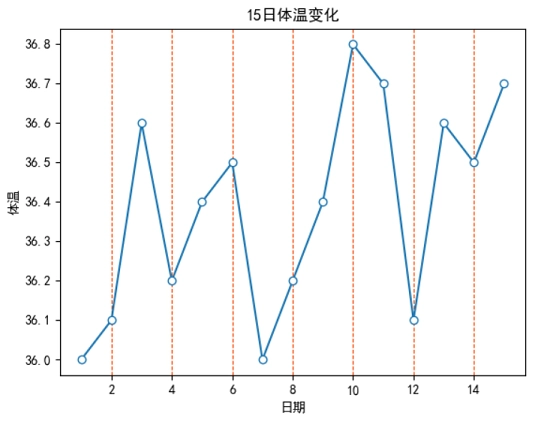
plt.show()运行之后,效果如下图所示。
分析:
plt.grid(axis='both', linestyle='dashed', color='orangered') 表示定义两个方向的网格线,其中网格线的外观是 “虚线”,颜色为 “橙红色”。
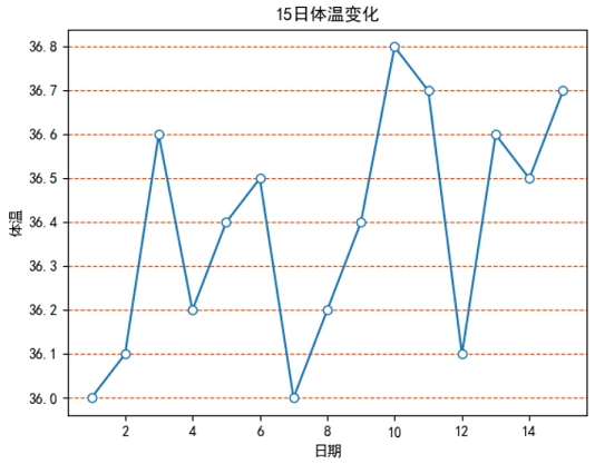
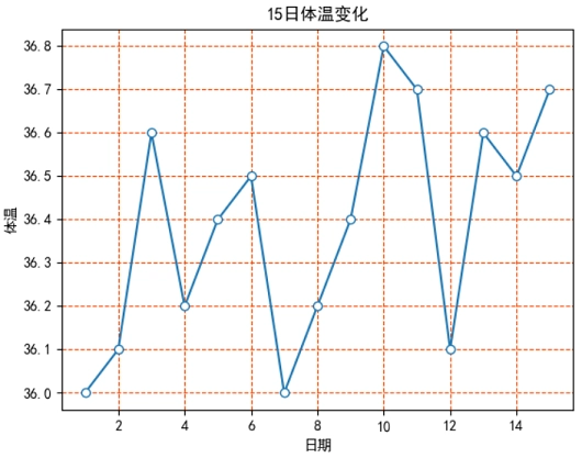
如果我们使用 axis='x',此时效果如下图 1 所示。如果使用 axis='y',此时效果如下图 2 所示。