


CSS animation-direction 语法
在 CSS 中,animation-direction 属性用于定义动画的播放方向。
语法:
animation-direction: 关键字;说明:
animation-direction 的取值是一个关键字,如下表所示。
| 属性值 | 说明 |
|---|---|
| normal(默认值) | 正方向播放 |
| reverse | 反方向播放 |
| alternate | 播放次数是奇数时,动画正方向播放;播放次数是偶数时,动画反方向播放 |
| alternate-reverse | 播放次数是奇数时,动画反方向播放;播放次数是偶数时,动画正方向播放 |
当 animation-name 属性指定了多个动画时,animation-direction 属性也应提供对应数量的方向值,用逗号分隔。这些值会按顺序与 animation-name 中的动画一一对应。
/* 应用多个动画,并指定各自的播放方向 */
.element {
    animation-name: slideIn, fadeIn;
    animation-duration: 1s, 2s;
    animation-iteration-count: infinite, 2;
    animation-direction: alternate, reverse;   /* slideIn 往复播放,fadeIn 两次都反向播放 */
}
提示:
- animation-direction 属性适用于所有元素,包括伪元素(::before, ::after)。
- animation-direction 与 animation-iteration-count 结合使用时效果最明显。如果 animation-iteration-count 为 1(默认值),那么 animation-direction 除了 reverse 之外,其他值没有可见区别。
CSS animation-direction 摘要
| 属于 | CSS 动画 |
|---|---|
| 使用频率 | 低 |
| 是否继承 | 否 |
| 默认值 | normal |
| 兼容性 | 查看 |
| 官方文档 | 查看 |
| MDN | 查看 |
CSS animation-direction 示例
接下来,我们通过一个简单的例子来讲解一下 CSS animation-direction 属性是如何使用的。
示例:animation-direction 基本用法
<!DOCTYPE html>
<html>
<head>
    <meta charset="utf-8">
    <title></title>
    <style>
        @keyframes mytranslate {
            0% {}
            100% { transform: translateX(260px); }
        }
        .ball {
            width: 40px;
            height: 40px;
            border-radius: 20px;
            background-color: red;
            animation-name: mytranslate;
            animation-duration: 2s;
            animation-timing-function: linear;
            animation-direction: reverse;
        }
        .container {
            display: inline-block;
            width: 300px;
            border: 1px solid gray;
        }
    </style>
</head>
<body>
    <div class="container">
        <div class="ball"></div>
    </div>
</body>
</html>页面效果如下图所示。
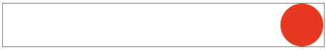
分析:
在这个例子中,由于我们使用了 animation-direction: reverse;,因此动画会沿着反方向播放(即从 100% 到 0%),小球从右到左移动。animation-direction 属性在实际开发中用得比较少,我们简单了解一下即可。
animation-name: mytranslate;
animation-timing-function: linear;
animation-duration: 2s;
animation-direction: reverse;
对于上面代码来说,其实可以简写为以下一行代码:
animation: mytranslate linear 2s reverse;animation 是一个复合属性
在 CSS 中,animation 是一个复合属性,它包含以下子属性(如下表所示)。
| 子属性 | 说明 |
|---|---|
| animation-name | 定义要应用的动画名称 |
| animation-duration | 定义动画的持续时间 |
| animation-timing-function | 定义动画的速度曲线 |
| animation-delay | 定义动画的延迟时间 |
| animation-iteration-count | 定义动画的重复次数 |
| animation-direction | 定义动画的方向 |
| animation-play-state | 定义动画的播放状态(运行或暂停) |
| animation-fill-mode | 定义动画在播放之前和之后如何应用样式到元素 |