


CSS flex-direction 语法
在 CSS 中,flex-direction 属性用于定义 flex 容器的主轴方向,它决定了子项的排列方向。
语法:
flex-direction: 关键字;说明:
flex-direction 属性的取值有 4 种,如下表所示。
| 属性 | 说明 |
|---|---|
| row(默认值) | 横向排列 |
| column | 纵向排列 |
| row-reverse | 横向反向排列 |
| column-reverse | 纵向反向排列 |
此外,小伙伴们还要清楚以下几点。
- 主轴的方向会直接影响 justify-content、align-items、align-content、gap 等属性的作用方向。
- 如果 flex-direction 属性取值为 row-reverse 或 column-reverse,此时会改变 flex 容器的子项的视觉顺序,但这不会改变文档的逻辑顺序或 DOM 顺序。
注意: flex-direction 属性只会作用于 flex 容器的 (display: flex; 或 display: inline-flex;)。
CSS flex-direction 摘要
| 属于 | CSS flex 布局 |
|---|---|
| 使用频率 | 高 |
| 是否继承 | 否 |
| 默认值 | row |
| 兼容性 | 查看 |
| 官方文档 | 查看 |
| MDN | 查看 |
CSS flex-direction 示例
接下来,我们通过一个简单的例子来讲解一下 flex-direction 属性是如何使用的。
示例:flex-direction 基本用法
<!DOCTYPE html>
<html>
<head>
    <meta charset="utf-8">
    <title></title>
    <style>
        .box {
            display: flex;
            flex-direction: row;
            width: 500px;
            height: 500px;
            background-color: skyblue;
        }
        .box > div {
            box-sizing: border-box;
            width: 100px;
            height: 100px;
            border: 1px solid silver;
            background-color: hotpink;
        }
    </style>
</head>
<body>
    <div class="box">
        <div>1</div>
        <div>2</div>
        <div>3</div>
    </div>
</body>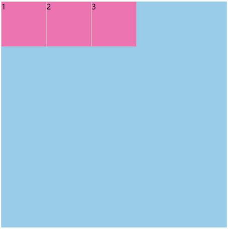
</html>页面效果如下图所示。
分析:
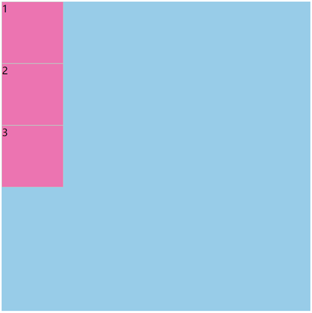
如果改为 flex-direction: column;,此时页面效果如下图所示。
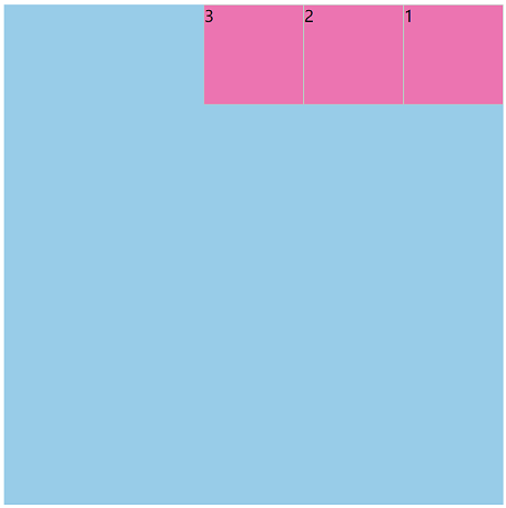
如果改为 flex-direction: row-reverse;,此时页面效果如下图所示。
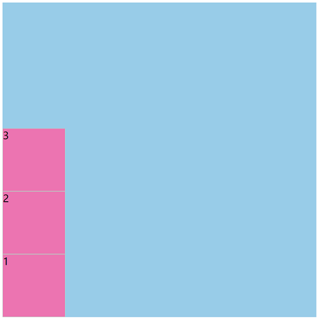
如果改为 flex-direction: column-reverse;,此时页面效果如下图所示。
flex-flow 是一个复合属性
在 CSS 中,flex-flow 是一个复合属性,它有 2 个子属性(如下表所示)。
| 子属性 | 说明 |
|---|---|
| flex-direction | 定义 flex 容器的主轴方向 |
| flex-wrap | 定义 flex 容器中子项是否换行显示 |