


CSS animation-timing-function 语法
在 CSS 中,animation-timing-function 属性定义动画播放的速度曲线。
语法:
animation-timing-function: 关键字或函数;说明:
animation-timing-function 的关键字取值有 5 种,如下表所示。
| 取值 | 说明 | 速率 |
|---|---|---|
| ease(默认值) | 由快到慢,逐渐变慢 | 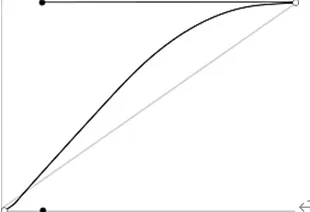 |
| linear | 匀速 | 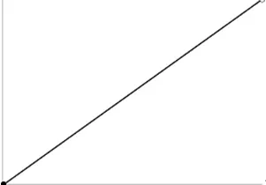 |
| ease-in | 速度越来越快 | 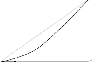 |
| ease-out | 速度越来越慢 | 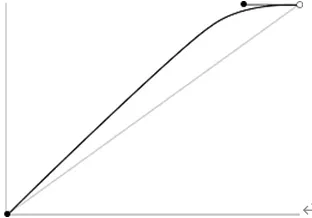 |
| ease-in-out | 先加速后减速 | 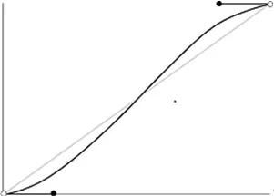 |
animation-timing-function 属性的函数取值有以下 2 种。
- steps():定义分步动画。
- cubic-bezier():自定义的贝塞尔曲线。
如果 animation-timing-function 提供了多个值,它们会依次对应 animation-name 中列出的属性。如果值数量少于属性数量,多余的属性将使用默认值 ease。
提示: animation-timing-function 属性适用于所有元素,包括伪元素(比如 ::before 和 ::after)。
CSS animation-timing-function 摘要
| 属于 | CSS 动画 |
|---|---|
| 使用频率 | 高 |
| 是否继承 | 否 |
| 默认值 | ease |
| 兼容性 | 查看 |
| 官方文档 | 查看 |
| MDN | 查看 |
CSS animation-timing-function 示例
接下来,我们通过一个简单的例子来讲解一下 animation-timing-function 属性是如何使用的。
示例:animation-timing-function 基本用法
<!DOCTYPE html>
<html>
<head>
    <meta charset="utf-8">
    <title></title>
    <style>
        /* 定义动画 */
        @keyframes mytransform
        {
            0% {}
            100% { width: 300px; }
        }

        div {
            width: 100px;
            height: 50px;
            line-height: 50px;
            text-align: center;
            margin-top: 10px;
            border-radius: 0;
            background-color: lightskyblue;
            animation-name: mytransform;   /* 调用动画 */
            animation-duration: 2s;
        }
        div:nth-child(1) { animation-timing-function: linear; }
        div:nth-child(2) { animation-timing-function: ease; }
        div:nth-child(3) { animation-timing-function: ease-in; }
        div:nth-child(4) { animation-timing-function: ease-out; }
        div:nth-child(5) { animation-timing-function: ease-in-out }
    </style>
</head>
<body>
    <div>linear</div>
    <div>ease</div>
    <div>ease-in</div>
    <div>ease-out</div>
    <div>ease-in-out</div>
</body>
</html>页面效果如下图所示。
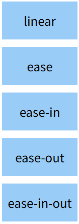
分析:
通过这个例子,我们可以直观地比较出这 5 种动画方式的不同。在实际开发中,我们应该根据实际需求来选取哪一种。
animation-timing-function 和 transition-timing-function 的区别
在 CSS 中,animation-timing-function 和 transition-timing-function 这两个属性看着非常相似,但它们的用途是不一样的。
animation-timing-function:定义的是 “动画(animation)” 的速度曲线。transition-timing-function:定义的是 “过渡(transition)” 的速度曲线。
animation 是一个复合属性
在 CSS 中,animation 是一个复合属性,它包含以下子属性(如下表所示)。
| 子属性 | 说明 |
|---|---|
| animation-name | 定义要应用的动画名称 |
| animation-duration | 定义动画的持续时间 |
| animation-timing-function | 定义动画的速度曲线 |
| animation-delay | 定义动画的延迟时间 |
| animation-iteration-count | 定义动画的重复次数 |
| animation-direction | 定义动画的方向 |
| animation-play-state | 定义动画的播放状态(运行或暂停) |
| animation-fill-mode | 定义动画在播放之前和之后如何应用样式到元素 |