


CSS justify-content 语法
在 CSS 中,justify-content 属性会将所有子项当做一个整体,然后定义该整体在主轴方向上的对齐方式(默认是水平方向的对齐方式)。
需要注意的是,主轴的方向由 flex-direction 属性决定。
- 如果 flex-direction: row;(默认值),主轴是水平的,此时 justify-content 控制水平对齐。
- 如果 flex-direction: column,主轴是垂直的,此时 justify-content 控制垂直对齐。
语法:
justify-content: 关键字;说明:
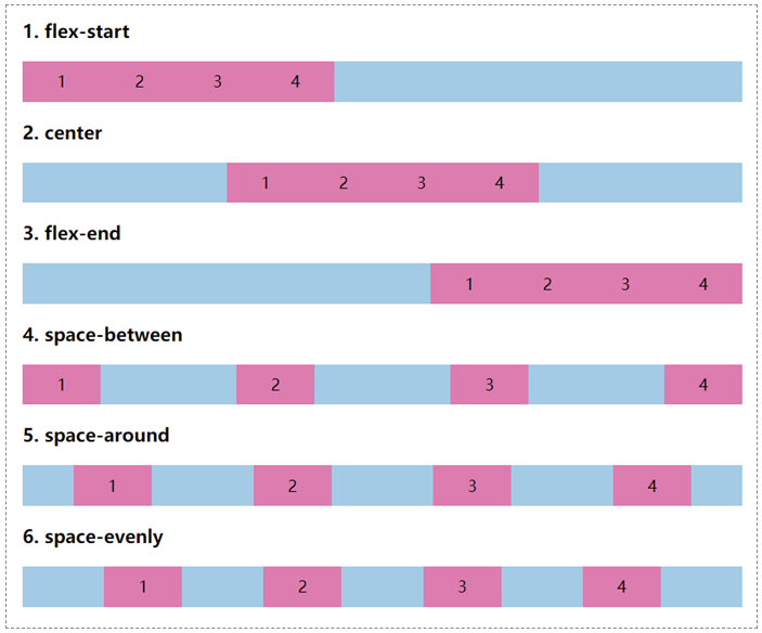
justify-content 属性取值是一个关键字,常用的如下表所示。这里我们只考虑默认情况下的对齐方式,即水平方向上的对齐方式。
| 属性 | 说明 |
|---|---|
| flex-start(默认值) | 所有子元素在左边(左端对齐) |
| center | 所有子元素在中间(居中对齐) |
| flex-end | 所有子元素在右边(右端对齐) |
| space-between | 子元素分布在左右两端(两端对齐) |
| space-around | 子元素平均分布(等分布局) |
| space-evenly | 任意子元素之间的间距以及边缘间距相等 |
注意:
- justify-contents 属性的每一种取值都极其重要,在实际开发中会大量使用。
- justify-content 属性主要用于弹性容器(Flexbox)和网格容器(Grid)。
CSS justify-content 摘要
| 属于 | CSS Flex 布局 / CSS Grid 布局 |
|---|---|
| 使用频率 | 高 |
| 是否继承 | 否 |
| 默认值 | flex-start |
| 兼容性 | 查看 |
| 官方文档 | 查看 |
| MDN | 查看 |
CSS justify-content 示例
接下来,我们通过一个简单的例子来讲解一下 justify-content 属性是如何使用的。
示例:justify-content 基本用法
<!DOCTYPE html>
<html>
<head>
	<meta charset="utf-8">
	<title></title>
    <style>
        /*定义整体样式*/
        .box {
            display: flex;
            flex-flow: row nowrap;
            background-color:skyblue;
            margin-bottom: 5px;
        }
        .box > div
        {
            width: 80px;
            padding:10px;
            text-align: center;
            background-color:hotpink;
            box-sizing: border-box;
        }
        /*定义justify-content*/
        .box1 { justify-content: flex-start; }
        .box2 { justify-content: center;}
        .box3 { justify-content: flex-end; }
        .box4 { justify-content: space-between; }
        .box5 { justify-content: space-around; }
        .box6 { justify-content: space-evenly; }
    </style>
</head>
<body>
    <h3>1. flex-start</h3>
    <div class="box box1">
        <div>1</div>
        <div>2</div>
        <div>3</div>
        <div>4</div>
    </div>
    <h3>2. center</h3>
    <div class="box box2">
        <div>1</div>
        <div>2</div>
        <div>3</div>
        <div>4</div>
    </div>
    <h3>3. flex-end</h3>
    <div class="box box3">
        <div>1</div>
        <div>2</div>
        <div>3</div>
        <div>4</div>
    </div>
    <h3>4. space-between</h3>
    <div class="box box4">
        <div>1</div>
        <div>2</div>
        <div>3</div>
        <div>4</div>
    </div>
    <h3>5. space-around</h3>
    <div class="box box5">
        <div>1</div>
        <div>2</div>
        <div>3</div>
        <div>4</div>
    </div>
    <h3>6. space-evenly</h3>
    <div class="box box6">
        <div>1</div>
        <div>2</div>
        <div>3</div>
        <div>4</div>
    </div>
</body>
</html>页面效果如下图所示。
justify-content 与 align-content 的区别
在 CSS 中,justify-content 与 align-content 看着非常相似,但它们有着本质上的区别:
justify-content:将所有子项当做一个整体,然后定义该整体在水平方向上的对齐方式。align-content:将所有子项当做一个整体,然后定义该整体在垂直方向上的对齐方式。