


CSS text-overflow 语法
在 CSS 中,text-overflow 属性用于定义文本溢出容器时的显示方式。它通常用于单行文本,配合 overflow: hidden; 和 white-space: nowrap; 使用,以防止文本溢出。
语法:
text-overflow: 关键字;说明:
text-overflow 的取值有 2 种,如下表所示。
| 取值 | 说明 |
|---|---|
| clip(默认值) | 溢出文本时,直接裁剪 |
| ellipsis | 溢出文本时,以省略号(...)表示 |
注意:
- text-overflow 需配合 overflow: hidden; 和 white-space: nowrap; 使用,否则无效。
- text-overflow 只适用于块级容器或内联块元素的单行文本。如果是多行文本,则需要额外处理。
CSS text-overflow 摘要
| 属于 | CSS 文本属性 |
|---|---|
| 使用频率 | 中 |
| 是否继承 | 否 |
| 默认值 | clip |
| 兼容性 | 查看 |
| 官方文档 | 查看 |
| MDN | 查看 |
CSS text-overflow 示例
接下来,我们通过几个简单的例子来讲解一下 CSS text-overflow 属性是如何使用的。
示例 1:单行文本溢出显示省略号
<!DOCTYPE html>
<html>
<head>
<meta charset="utf-8">
<style>
div {
overflow: hidden;
white-space: nowrap;
text-overflow: ellipsis;
width: 200px;
font-size: 16px;
font-family: "PingFang SC", sans-serif;
background-color: lightskyblue;
padding: 5px;
}
</style>
</head>
<body>
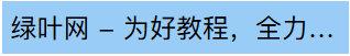
<div>绿叶网 - 为好教程,全力以赴。</div>
</body>
</html>页面效果如下图所示。
分析:
overflow: hidden; 用于隐藏溢出部分,white-space: nowrap; 用于防止换行,text-overflow: ellipsis; 用于在文本溢出时显示省略号(…)。这 3 个都是搭配一起使用的。
overflow: hidden;
white-space: nowrap;
text-overflow: ellipsis;
实际上,咱们绿叶网不少地方也用到了这个技巧,比如搜索结果页。
示例 2:表格单元格文本溢出
<!DOCTYPE html>
<html>
<head>
<meta charset="utf-8">
<style>
table {
width: 400px;
border-collapse: collapse;
table-layout: fixed;
}
td {
overflow: hidden;
white-space: nowrap;
text-overflow: ellipsis;
padding: 8px;
max-width: 150px;
border: 1px solid silver;
}
</style>
</head>
<body>
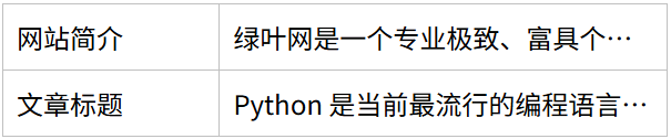
<table>
<tr>
<td>网站简介</td>
<td>绿叶网是一个专业极致、富具个性的网站。在这里,我们只提供能让你眼前一亮的教程、手册、图书等。</td>
</tr>
<tr>
<td>文章标题</td>
<td>Python 是当前最流行的编程语言之一,广泛用于机器学习、人工智能、大数据等。</td>
</tr>
</table>
</body>
</html>页面效果如下图所示。
分析:
在这个例子中,max-width 限制单元格宽度,以防止表格变形。text-overflow: ellipsis; 确保表格单元格内长文本以省略号显示。