


CSS transform-style 语法
在 CSS 中,transform-style 属性用于定义子元素在 3D 空间中的呈现方式。它决定了:当父元素应用了 3D 变换后,子元素是继续保留各自的 3D 形态,还是全部 “展平” 为一个平面。
语法:
transform-style: 关键字;说明:
transform-style 的取值有以下 2 种。
flat(默认值):子元素不会保留其自身的 3D 转换,它们会 “展平” 到父元素的 2D 渲染平面上。从视觉上看,即使子元素本身有 3D 转换,它们在父元素 3D 变换后的效果也像是位于同一个平面上。preserve-3d:子元素将保留自己的 3D 转换。这意味着子元素会在父元素的 3D 空间中进行渲染,它们的 3D 位置和旋转将相对于父元素的 3D 变换原点和轴。这种方式适合用于创建卡片翻转、立方体、全景动画等。
此外,想要看到 transform-style: preserve-3d; 的效果,需要满足以下条件:
- 父元素或其祖先必须设置了 perspective,这相当于给整个 3D 空间添加了一个 “观察视角”。
- 子元素必须应用 3D 转换,比如使用 rotateX()、rotateY()、translateZ() 等,纯 2D 变换不会体现出深度效果。
注意:
- transform-style 属性应该用于父元素,而不是子元素。因为它控制的是 “子元素的空间渲染方式”。
- 如果父元素设置了 overflow: hidden、scroll 或 auto,浏览器可能会创建新的堆叠上下文,从而强制把 transform-style 设为 flat,导致 preserve-3d 失效。
CSS transform-style 摘要
| 属于 | CSS3 变换 |
|---|---|
| 使用频率 | 中 |
| 是否继承 | 否 |
| 默认值 | flat |
| 兼容性 | 查看 |
| 官方文档 | 查看 |
| MDN | 查看 |
CSS transform-style 示例
接下来,我们通过几个简单的例子来讲解一下 CSS transform-style 属性是如何使用的。
示例 1:transform-style: flat;
<!DOCTYPE html>
<html>
<head>
    <meta charset="utf-8">
    <title></title>
    <style>
        div {
            display: flex;
            justify-content: center;
            align-items: center;
        }
        .scene {
            width: 200px;
            height: 200px;
            margin: 50px;
            perspective: 600px;            /* 父元素提供 3D 视角 */
            background-color: lightskyblue;
            transform-style: flat;         /* 默认值,子元素展平 */
        }
        .parent {
            width: 150px;
            height: 150px;
            background-color: lightseagreen;
            transform: rotateY(45deg);     /* 父元素 Y 轴旋转 */
        }
        .child {
            width: 80px;
            height: 80px;
            background-color: salmon;
            transform: translateZ(50px);   /* 子元素在 Z 轴上移动 */
        }
    </style>
</head>
<body>
    <div class="scene">
        <div class="parent">
            父元素
            <div class="child">子元素</div>
        </div>
    </div>
</body>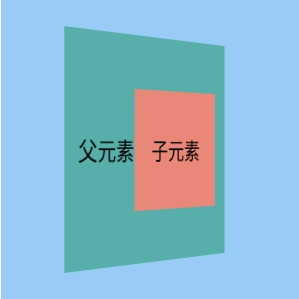
</html>页面效果如下图所示。
分析:
在这个例子中,scene 容器提供了 3D 视角,parent 元素旋转了 45 度,child 元素尝试在 Z 轴上移动了 50px。不过由于 scene 的 transform-style 默认为 flat,child 的 translateZ 效果并没有在 3D 空间中体现出来,它看起来仍然是平铺在旋转后的父元素表面上。
示例 2:transform-style: perspective-3d;
<!DOCTYPE html>
<html>
<head>
    <meta charset="utf-8">
    <title></title>
    <style>
        div {
            display: flex;
            justify-content: center;
            align-items: center;
        }
        .scene {
            width: 200px;
            height: 200px;
            margin: 50px;
            perspective: 600px;            /* 父元素提供 3D 视角 */
            background-color: lightskyblue;
        }
        .parent {
            width: 150px;
            height: 150px;
            background-color: lightseagreen;
            transform: rotateY(45deg);     /* 父元素 Y 轴旋转 */
            transform-style: preserve-3d;  /* 父元素设置 preserve-3d */
        }
        .child {
            width: 80px;
            height: 80px;
            background-color: salmon;
            transform: translateZ(50px);   /* 子元素在 Z 轴上移动 */
        }
    </style>
</head>
<body>
    <div class="scene">
        <div class="parent">
            父元素
            <div class="child">子元素</div>
        </div>
    </div>
</body>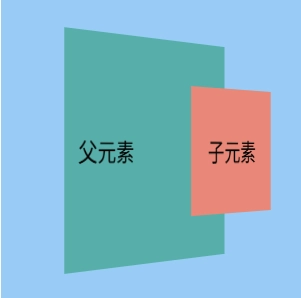
</html>页面效果如下图所示。
分析:
这个例子与上一个例子相同,parent 旋转了 45 度,child 尝试在 Z 轴上移动了 50px。关键在于 parent 现在设置了 transform-style: preserve-3d;,此时我们可以看到 child 确实在 Z 轴上向外 “突出” 了 50px,因为它保留了自身的 3D 转换,参与到了父元素的 3D 空间中。
示例 3:transform-style 的实际应用
<!DOCTYPE html>
<html>
<head>
    <meta charset="utf-8">
    <title></title>
    <style>
        .scene {
            width: 200px;
            height: 200px;
            border: 2px solid #eee;
            margin: 50px;
            perspective: 800px;   /* 3D 视角 */
            display: flex;
            justify-content: center;
            align-items: center;
            background-color: #f8f8f8;
        }

        .container {
            width: 100px;
            height: 100px;
            position: relative;
            transform-style: preserve-3d;                /* 关键:子元素保留 3D 转换 */
            transform: rotateX(-30deg) rotateY(30deg);   /* 容器旋转以显示 3D 效果 */
            transition: transform 1s ease-in-out;
        }

        .face {
            position: absolute;
            width: 100px;
            height: 100px;
            background-color: rgba(0, 150, 136, 0.7);  /* 绿色半透明 */
            border: 1px solid #009688;
            display: flex;
            justify-content: center;
            align-items: center;
            font-weight: bold;
            color: white;
            font-size: 1.2em;
        }

        .front { transform: translateZ(50px); }
        .back { transform: rotateY(180deg) translateZ(50px); background-color: rgba(255, 87, 34, 0.7); }   /* 橙色 */
        .right { transform: rotateY(90deg) translateZ(50px); background-color: rgba(63, 81, 181, 0.7); }   /* 蓝色 */
        .left { transform: rotateY(-90deg) translateZ(50px); background-color: rgba(156, 39, 176, 0.7); }  /* 紫色 */
        .top { transform: rotateX(90deg) translateZ(50px); background-color: rgba(255, 193, 7, 0.7); }     /* 黄色 */
        .bottom { transform: rotateX(-90deg) translateZ(50px); background-color: rgba(76, 175, 80, 0.7); } /* 浅绿 */

        .container:hover {
            transform: rotateX(-120deg) rotateY(120deg);   /* 鼠标悬停时旋转 */
        }
    </style>
</head>
<body>
    <div class="scene">
        <div class="container">
            <div class="face front">前</div>
            <div class="face back">后</div>
            <div class="face right">右</div>
            <div class="face left">左</div>
            <div class="face top">上</div>
            <div class="face bottom">下</div>
        </div>
    </div>
</body>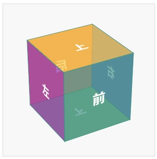
</html>页面效果如下图所示。
分析:
在这个例子中,我们展示了 transform-style: preserve-3d; 的一个经典应用:创建一个 3D 立方体。小伙伴们可以将鼠标悬停在立方体上,来看看它的 3D 旋转效果。
其中, container 是父元素,我们给它设置了 transform-style: preserve-3d;。它的 6 个子元素(face)各自应用了 3D 转换(旋转和 Z 轴平移)以形成立方体的各个面。
由于父元素设置了 preserve-3d,子元素会在父元素的 3D 空间中被正确渲染,从而形成一个具有深度的 3D 对象。当我们将鼠标悬停在立方体上时,整个立方体会在 3D 空间中旋转。